From whence you came
Every Monday I get a clever little automatic email from the blog, which contains a PDF with data about the performance of this website over the last 7 days. It contains helpful info, such as how often certain pages are bouncing (fortunately almost never) and which pages generated the most traffic. For instance, I can see that over the last week there were 258 unique individuals who visited AntarcticDoctor 950 times, and about a quarter of those downloaded the April SANAE 47 newsletter. It helps me get an idea of the impact of the blog, and also insight into what technical features work, as I get a breakdown by browser type, connection speed, etc.
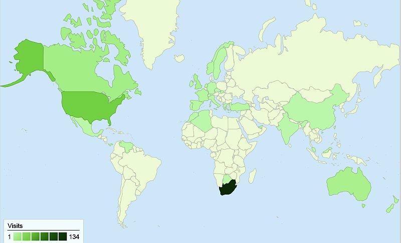
One thing I really enjoy is the map page, that shows visually where all you readers are located. As you can see above, even over the space of only one week, all seven continents are covered (well, I’m in Antarctica, aren’t I?) and apart from the obvious quantity of traffic from SA, there is also significant interest from many other corners of the globe. So, while you’re all out there looking down here at us, here’s looking at you!
